In today’s competitive market, a key element of success is the use of cutting-edge technology and website design. One of the major website trends today is responsive web design (RWD). Simply put, if your website doesn’t have a responsive web design, your business may be underperforming.
How responsive website design can increase sales
What is Responsive Website Design?
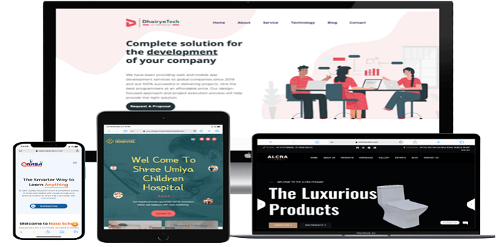
You may have come across responsive websites while surfing online. These are websites that adapt quickly and automatically to your device screen size. Responsive web design ensures that your website content displays correctly and consistently across multiple devices, platforms and screen sizes without the need to create multiple web pages. Special coding techniques are used to allow the website to automatically adapt to the device or screen size to provide the best possible user experience.
The ability for your website to look attractive and remain user-friendly on any screen size is important because many consumers now use mobile devices. Websites with responsive website designs look great on laptops and desktops, but they also adapt seamlessly to small mobile screens without annoying zooming and scrolling than.
Mobile Trends
Your website is a tool for branding and generating revenue. If your website doesn’t display well on users’ devices, their opinion of your brand may suffer. If browsing your site on a smartphone or tablet results in an unpleasant experience, users are likely to click away and find one of your responsively designed competitor sites to replace.
According to the Pew Research Center, 56% of American adults now own a smartphone and 34% of them own a tablet. 34% of smartphone internet users say their primary way of getting online is through a mobile phone (instead of a desktop or laptop computer). Cisco Systems reported an 81% increase in smartphone usage in 2012, and IDC reported top PC sales for Q4 2013.
Google estimates that 90% of users switch between their different devices to achieve an online goal, such as making a purchase. Clearly, businesses that provide the most seamless online experience across all platforms will be able to drive more interactions, more positive brand sentiment, and ultimately more sales.
Invest in success
Responsive web design uses the same core design elements across platforms, visually adapting them to the viewing environment. Flexible aspect-based grids and flexible images ensure that your website will be optimized to deliver what your customers are looking for on any device.
Conclusion
Ready to link your website and business with today’s technology? Contact DhairyaTech to become “more responsive” today.